Microsoft Office 2013 Preview: Hands On
For the desktop, Office 2013 delivers a host of smart updates to Word, Outlook, and Excel. But where Office 2013 shines is in embracing the mobile world and the cloud, delivering deep integration with Microsoft’s cloud service SkyDrive and collaboration through its recent acquisitions Skype and Yammer. Windows 8–and the upcoming release of Microsoft Surface tablets and Windows Phone 8 smartphones–have also played a huge roles in coloring Office 2013 with new features.
Here’s a look at how the software suite runs on laptop, desktop touchscreen, and tablet platforms.
In this story, Hitek Australia gives its first gives his impressions of working with Office 2013 and 365 on a laptop and a desktop PC.
I spent most of my time with Word and Excel on a laptop and on a desktop all-in-one equipped with a touchscreen. As expected, Microsoft is tying Office 2013 and Office 365 tightly to its SkyDrive cloud-storage service.
You’re free to use other services, but I suspect that this integration will lure plenty of Office users away from their paid accounts on Google, Dropbox, and SugarSync. If you buy a version of Microsoft’s new software and sign up for a Microsoft Live account, you’ll get 20GB of free storage in SkyDrive.
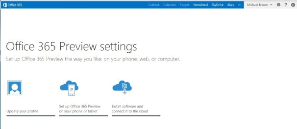
The Ofiice 365 Preview settings screen.
Both Office 2013 and Office 365 offer largely the same user experience, but Microsoft is clearly steering its customers toward the cloud-based version. The company is also marketing Office 365 to consumers for the first time, rather than strictly to businesses.
Purchase the traditional boxed copy of the software, and you get a license to install the software on one device. You can also use Office 365 on any computer or tablet, but that won’t be very useful if you find yourself somewhere without your usual computer and without Internet access.
Buy a subscription to Office 365, and you get licenses to download and install Office 2013 on up to five devices (right now, the list of compatible devices is limited to PCs and tablets running Windows 7 or Windows 8, though Microsoft says Office 2013 for Mac will be available by the time the final software is released).
And, as with the boxed copy, you can stream Office 2013 to any PC or tablet running Windows 7 or Windows 8. Microsoft has not yet announced pricing for either product.
The New User Interface
The Office 2013 user interface isn’t markedly different from the one in Office 2010: The ribbon remains front and center, though the text and the icons inside it are a bit larger and are spaced farther apart. These changes take better advantage of large monitors and touchscreen displays. Nevertheless, the ribbon isn’t too big for an average laptop display, even with the addition of two new tabs: Design and Developer (actually, the Developer tab is present in Office 2010, but it’s hidden by default).

If you’re familiar with the ribbon user interface from Office 2007 and Office 2010, you’ll feel right at home with Word 2013.
Though I’ve used a number of all-in-one computers with touchscreens over the past few years, I don’t use the touch interface very often. Perhaps I’m just a creature of habit, but it doesn’t feel natural to take my fingers off the mouse to stab them at icons on the screen (or maybe my fingers are just too fat to be accurate). In any event, though I tried hard to use the ribbon with my finger, I kept returning to the mouse. The UI delivers more benefits on tablet platforms, but it doesn’t feel any less natural when used with a mouse.
New and Cool Word Features
Microsoft has made a number of cool, interesting, and very useful improvements to Word 2013.
![]()
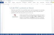
The Embed PDF feature in Word.On the usefulness front, you can now import a PDF directly into Word, edit it as a Word doc, and then save it as either a Word doc or a PDF. Not only do imported files retain all of the original documents’ formatting–including headers, columns, and footnotes–but elements such as tables and graphics can be edited in Word as such.
Import a PDF file containing a table, for example, and you can edit the table just as though you had created it in Word from scratch. You can also embed a PDF file in a Word doc.
![]()
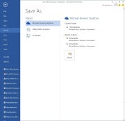
Microsoft expects that people will want to save all of their files to the cloud. Your SkyDrive account is listed first, then Another cool feature is the ability to connect to online resources and bring them inside your documents. For example, you can use Bing to search the Web for videos, without leaving Word, and then embed the HTML code for that video in your document.
Link your SkyDrive account to your Flickr account, and you can jump to your online photo collection and embed photos directly in the document–again, without ever leaving Word.
Embedding a screenshot from an app running on your PC is even easier: Click Insert > Screenshot, and a window with thumbnails of every window open on your desktop will become visible. Click the image you want, and it will appear wherever your cursor is.
When you embed an image or a video in a document, you can grab that element and move it around the document and watch as your text automatically reflows around it in real time.
Word Collaboration Features
When you’re collaborating with other people on a document, being able to track the changes that each person makes is critical. This becomes much easier to do in Word 2013, thanks to a new feature called simple markup view.
A red vertical line in the left margin indicates that changes have been made to the document, while a word balloon in the right margin indicates the presence of a comment. Click on the vertical line to reveal both the edit changes and the comments; click on the word balloon to show just the comments.

Microsoft has also added a new viewing mode, called Reader. When you view a document in this mode, each paragraph has a small triangle in front of it. Click the triangle after you’ve finished reading its associated paragraph, and the paragraph will collapse so that more text will appear, without your having to scroll to another page.
I haven’t had time to explore every new feature of Word 2013, but I like what I’ve seen so far. It looks as though Microsoft has significantly improved the application, adding some great new features without mucking anything else up in the process. Nevertheless, my opinion at this stage is based on very limited time with the product.
Excel 2013
Like the new version of Word, Excel 2013 feels fresh yet comfortingly familiar. Microsoft has added several new whiz-bang data-analysis tools, including one called Flash Fill. When you take an element of data that you’ve already entered in one column and enter it in a second column, Flash Fill will predict that you intend to do that for every value in the second column, and will offer to fill in the second column for you accordingly.
![]()
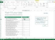
Excel’s Flash Fill feature will notice patterns in your data entry, predict what you intend to do next, and then offer to fill in the rest of the data for you.
Microsoft provided a sample two-column spreadsheet to demonstrate how this feature works. The first column contained email addresses in which each person’s address was formatted as first-name.last-name@domain-name. The second column was to be used to store each person’s first name.
Though that isn’t the most realistic scenario imaginable, it works. You establish the reference example by typing the first name of the first person in the email address column; then, as you begin typing the second person’s first name, Excel predicts that you want to do the same for every other value in the first column and offers to do just that automatically. Press the Enter key, and the second column automatically fills with first names.
Colors and symbols can help you analyze data more quickly, and Excel 2013’s new Quick Analysis tool uses these elements to identify and highlight trends and changes. Select the rows and columns that you wish to have analyzed, click the icon that appears in the bottom right corner, and choose the conditional formatting that suits your needs. Instead of looking at rows and columns of gray numbers, you’ll instantly see a spreadsheet formatted with color scales, bars, and icons.
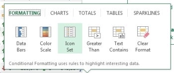
Excel’s Quick Analysis tool automatically suggests conditional formatting that will help you visualize data locked in your spreadsheets.Charts and graphs provide another easy way to visualize data, and spreadsheet software has long permitted users to generate charts and graphs based on the data they enter into its rows and columns.
Excel 2013’s new Quick Analysis tool will automatically suggest the most appropriate types of graphs–bar, pie, scatter, and so on–based on the data set that you select.
My early impressions of Excel 2013 are about as favorable as my corresponding impressions of Word 2013. Microsoft seems to have introduced some solid new features without imposing a difficult learning curve. Take that, ribbon haters.
We’ll take a closer look at Outlook, Powerpoint, OneNote, and the rest of the suite soon.

 Hitek Remote Support Call







Leave a Reply